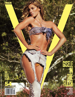
I have chosen V Magazine because it has some of the same conventions as my magazine. V Magazine is a high fashion focused magazine which comes out once a month.
They both say the name of the featured model/ artist on the front. This, except from the model on the front will also be a main element in attracting the audience to want to buy the magazine. Sometimes they may not recognise the person on the cover, so when they see their names, it would re insure them who the person actually is on the front cover. So then, they can ultimately decide if they want to or not to buy the magazine. So by having the name of the featured person on the front is very important in getting people to buy the magazine.
The ‘masthead’ of these magazines are very different from the conventional magazines you see on the newsstands, instead of having the masthead at the top of the page, they both have the letter name of their magazine behind the model which makes it look more interesting and artistic and more appealing to the audience to look at.
Same camera shot used for both of these covers, on V Magazine’s cover, the model Gisele Bundchen has struck into a high fashion couture pose. On mine, I have placed my model in the same position in the middle of the page. This will draw attention straight away from the audience and make them want to know who is on the cover.
Currently, there are a few magazines that have just one letter for their name. For example with this particular magazine, Q and W magazine which is again a high fashion magazine. I think that reason for this is because by just having one letter, it is more likely to stand out to the audience on a magazine stand because there is just one thing.


No comments:
Post a Comment