Friday, 25 March 2011

Evaluation - Looking back at your preliminary task (the school magazine task), what do you feel you have learnt in the progression from it to full product?

Preliminary


I found that when I was doing my Preliminary task, I was just kinda playing around with the effects. Now that I look at it, the front of the page has too many effects on it. As I had never used photosop before, I was kinda of lost on what to do, so I played around on it for a few hours and gradually I found my way and realised how to do the effects and do the basic cut outs and understanding the layering steps.


Comparing the magazines that I have created, I really think that I have improved in camerawork. In my prelim magazine, the photos were all kinda the same. They had the same expressions on the models unlike my final magazine. The first thing that came into my mind about what the pictures were going to look like for my final magazine at the start was that I wanted it to be fun, I wanted the model laughing and having a good time because when you see a real laughing photo, it makes you smile. So that was what I wanted to achieve when I was taking the pictures for my real magazine. I had the model try and few different expressions, and the first time I saw the photo that is now on the cover, I knew that it had to be used as the cover photo.

When using photoshop, I found that I had better experience at editing and cutting out the photos this time, like using the lasso tool to cut out the images. For example with the front cover, I had to cut down from the neck down of the model to be able to get the layering effect of the M behind her, I found that because I had already had some experience with using this particlar tool, I found it much easier to get accurate and neat cuttings. I also understood the layers are you have to use to create the overall image more the second time in photoshop.

I felt that my contents page and my cover are a lot better than my prelimniary, this is because of the colours I had used for them, I thought that it was quite bland compared to my final one. I really think that if these two magazines were to be on sale, my final one would be the best selling one because of the colours that have been used and the layout which gives a much more professional and cleaner appearance. When looking at other magazines, I defiinitley think that my cover doesn't have that music magazine look to it, I think I have leaned more into the fashion magazine look like V Magazine and W. But I think by making it look fashion related, this would be attracting more readers than you typical music magazine which just focuses on music when mine focuses on mainly music, but incoporates fashion and art aswell.

By looking at my final magazine, there are definitley some changes that I would make to it. For example with the front page, i feel as though there needs to be more writing, it looks kind of plain and if I hadn't use the bright colours, I really think that it wouldn't be an attractive cover. In the double page spread, I woud definitely change the layout of the text, maybe have more pictures in the columns of the artist and also use more fonts to bring out the importantr quotes from the article to make is stand out to the readers which would also make it more appealing as an overall page.


Evaluation - What have you learnt about technologies from the process of constructing this product?

In pairs, take a picture of each other holding the kit you have used. This might just be the camera and tripod, and your Macbook but there may be other things you want in the shot.
Drop the image onto your blog and annotate it, adding all the programs and other technology you have used as screengrabs and what you learnt about it/from using it. Your written text need only be minimal. You could include reference to all the online and computer programs you have used such as flickr, blogger, facebook, photoshop, vimeo, scribd, slideshare etc.

School PC's
While at school, I used the school computers which did a very good job of just doing the basics. It was easy to do all my blogs and just use the internet for research etc. But when it came to using photoshop on these computers, I found that at times they can be quite slow and on more than one occasion the program would just freeze and I would end up losing some of the work I had done.

My PC
At home, I have a Dell M501R. I found that working from home was the best way of acheiving the best finish on my magazine. I could download whichever font I had wanted unlike if I were to use photoshop at school, I also found that it never one froze on me and made me lose my work. I made sure that I saved every few minutes to make sure that if anything were to happen I didn't lose the work that I had done.


Camera
The camera that I had used to take my pictures with was a Panasonic Lumix TZ10, I found that this camera was very good for just taking still pictures with my model. Although I did try to take motion shots with my model either jumping or moving to get a varierty of different shots, the pictures turned out not as clear as I thought it would be.


Photoshop
The photoshop that I have at home is CS5, I found that this particular version of the software gave me more freedom and effects to play with. By looking at the end result, I think that I couldn't have acheived the final finish of the magazine with using the basic version the school had on their computers which was Photoshop Elements. Although you could do the basics, I thought that by using CS5 it allowed me to go into more detail and do more with the pictures and texts.


Blogger
I have used Blogger as a diary to reocrd what steps I took while creating my magazine, the very first thing I did before making the magazine was make a blog explaining my initial idea about what my magazine was going to be like. I would say that blogger is now easy to use for me, first I didn't understand it but now I find it very easy and useful to use.


Scribd
I had used Scribd to upload my word docuements to the internet and then I embedded it into my blog. This let me use Microsoft Word to put my work into. I thought that it would be a good idea to use other technologies instead of just blogging to show a variety of way in which you could do your work.


Animoto
For my magazine pitch, I created a slide show of pictures and texts to show my class what my magazine was going to be like. Animoto allowed me to create a professional looking video with added sound effects and I found it really easy to actually make the video as all you had to do was just get pictures and put them together and then Animotot would put everything together for you.


Evaluation - How did you attract/address your audience?

Evaluation - Who would be the audience for your media product?

In my head, I can see the target audience of my magazine. I think that the magazine would be appealing to a range of people to both sexes, boys and girls. Depending on who is on the front cover, this would attract different audiences. For example if I were to put someone like Justin Bieber on the cover, this would mainly attract girls but if I were to put someone like Katy Perry or Jessie J in a sexy tasteful outfit which would attract to girls because they woluld buy the magazine because of her music, and for the boys because of an atractive female on the front but they could also just buy the magazine to see what it is about.
I would say that my target audience would have to have a specific taste to be able to buy my magazine, they would have to have an interest in fashion as the artist's sense of style is very important to their image to their fans. I would say that my stereotypical audience would shop somewhere like TOPSHOP, TOPMAN, River Island, All Saints. All the young high street shops that sell young and modern clothes.
 
They would probably have like POP music to really enjoy my magazine and like to listen to pop artists like Lady Gaga, Britney Spears, Nicki Minaj etc. I have chosen this particular genre to base my magazine on because of how versatile it is, you can get artists like Britney who is just your classic pop, then there are people like Nicki Minaj who bring a R n B element to their music incoporating rap which could grab new audiences from the R n B group who normally wouldn't losten to pop music.
 
I would say that my tagret audience would be influenced a lot of what they see on tv, they would probably watch shows like Gossip Girl, 90210, Glee. Anything that is current and popular they would watch.
 

Wednesday, 23 March 2011

Evaluation - What kind of media institution might distribute your media product and why?

A publishing company is a company which is the occupation, business, or activity of preparing and issuing books, journals, and other material for sale so they are available for the public.

The publishing company who I think would publish my magazine would be someone like Conde Nast, I have chosen this particular company because they currently do not publish a music magazine so I think that my magazine would be a perfect addition to the collection. Conde Nast are globally known for publishing some of the major magazines, from VOGUE, GQ, Vanity Fair, LOVE and many more. Most of their magazines are mainly fashion based, but I think that because my magazine is incorporating music, fashion and art. I really think that it would appeal to some of the usual readers from the other magazines. For example I could get some of the young readers of VOGUE to read my magazine because of the fashion, then I could get some of the readers from GQ for the art and culture so I think that by binding different elements besides from just having a music magazine, it would really be a good addition to the company as they already have a family of major well known magazines so it would be easier to get readers to come and buy the magazine.

Evaluation - How does your media product represent particular social groups?

I think that my magazine represents a particular group of people who like fashion, art, culture and music. I can see people from the ages of 16 to 25 maybe, I have created quite a young and modern magazine which represents a young group of people who care about fashion, celebrity culture and of course pop music. The artists that I could see being in my magazine that are current right now are people like Katy Perry, Rihanna, Britney Spears, Lady Gaga and Madonna even though this is a young and modern magazine, I think that Madonna represents the evolution of POP re-creating her music and re-inventing herself so many times to keep people interested.

Another artist who is simliar to mine is someone like Katy Perry. They are both Pop artists and have re-created themselves and their sounds to be current.

Katy Perry's style is very fun and colourful, ever since her recent second album 'Teenage Dream' she has totally changed her appearance from her debut album 'One of the Boys' which was a very classic girl next door look. Listening to both albums, you can clearly see the differences, at the very start of her first single 'I Kissed A Girl' people thought she was a one hit wonder. but she then continued to released top 10 hits like 'Hot N Cold' and 'Waking Up In Vegas' to show that she really does have talent. Then coming back to the phenominal second album and single release 'California Gurls' featuring Snoop Dog which went straight to numbr one.


Unlike Katy Perry, the artist featured in my magazine Chanel Smith started working in the music industry from a very young tender age and now she has come back by re-inventing herself and her sound to start the next stage of her life. They are both at the same age, race and styles and have the same target audience.


So I think these two artists represent a particular group of people who follow fashion trends, like to listen to pop music, they also have an appealing personlity and conifendence which will make it eaiser for the audience to like them.

Evaluation - In what ways does your media product use, develop or challenge forms and conventions of real media products?

Firstly, I am going to be talking about the name of my magazine which is 'M' which stands for Music. I thought that this would be pretty obvious as it is a Music magazine, so I think that by using a acronym it plays on the reader's mind and makes them think about what it stands for. But when they take a read of what is on the cover, they will release that it is a Music magazine. Other music magazines which have either just one letter or a couple of letters are magazines like Q and NME, I think that the reason for just using letters as the name for it is because it is easy to read and remember. I also think that by just using one letter, it makes the cover of the magazine stand out more, as I have got my model in the middle of the page and the 'M' kind of hugging and surrounding her, it closes her into the middle and forces the audiences to eyes to look at her so in my opinion I think that my magazine uses the convention of a Music magazine.

In my magazine, I have kept the layout pretty simple. For the cover I kept to the conventional 3 colour palette with blue, pink and white, this kept my cover looking professional and simple. I wanted the model to be the attraction of the page. So to do this, I decided to do a surrounding effect around her with the 'M' and her name written on both sides and the other featured articles and artists in the middle. I think that this layout it very simple and it doesn't draw too much attention away from the featured model and creates a sort of symmetrical appearance to the eye. For my contents page, I have kept it simple again by just using columns, this again keeps the overall appearance of the page appealing to the reader's eyes. It's easy to read, you just scan down the columns to see what is inside this particular issue of the magazine and there is also a picture of the artist from the cover on there aswell. Lastly, my double page spread, I have followed the generic convention of using laid out columns for my article, I have done this because I wanted it to be easy for the reader to read and not get distracted by having words all over the place. I have kept it simple and clean so it has an overall appealing appearance for the reader. I have also used on of the pages for the double page spread as a full photo of the artist, I have done this because I didn't want the double page spread just to have words on it. I wanted it to be interesting, so by using pictures in my double page spread I am following a convention of any magazine overall because usually when I pick up a magazine either if its fashion or music, the artist/ celebrity that they are featuring will normally have a couple of photos for the double page spread article. 

For the front cover, my model is wearing a embroidered anchored polo shirt and high waisted black skinny jeans, I reason I chose the blue anchored top was because it was a navy blue, and I thought that this would be easy to edit and enhance the colours to get my pop art effect. I wanted the artist featured on my front page to not be too fashion forward because it is supposed to be a Music magazine. So I kept the outfit that she was wearing quite casual and young conveying to the audience what kind and person she is and what kind of music she produces. The shot of her is a frontal mid shot showing her upper body and some of her legs, I used this particular shot because I really liked the expression on her face, it's sort of cheeky in a way and it makes the people looking at the cover think that there is something on there. 

I have chosen to use a couple of fonts for my magazine, for the 'M' on the cover I chose the font 'TALLEREVOLUTION' to get the slim figure of the M to give it a professional look. Then artist's name, I chose to use 'Lane D' which had more width to it to make the artist's name stand out to the reader. In my double page spread, I chose to use 'Calibri' for the font of the article, this was clear and easy to read for the reader and kept it looking nice and professional. 

I would definitely think that the overall appearance of the magazine tells the audience what genre of Music it belongs to, by using bright bold colours and colour blocking I definitely think that it conveys to the readers that this is a POP magazine. In the front cover, I have used Andy Warhol's pop art style editing on my model and the classic green background like Warhol used for his canvas of Marilyn Monroe and I really think that this helps lift the cover and make it more noticeable to the audience and I have done this throughout my pages.

The colour scheme I have went with is Andy Warhol's pop art, for my front cover I have used the 3 colour palette for my texts and also in the contents page unlike my double page spread where I have only used one colour for the font which is black to make it easier for the reader to read. I really thought that by taking inspiration from Andy Warhol it would really appeal to my target audience.


Evaluation - Comparing the conventions of an existing magazine to my final music magazine

I have chosen V Magazine because it has some of the same conventions as my magazine. V Magazine is a high fashion focused magazine which comes out once a month. 

They both say the name of the featured model/ artist on the front. This, except from the model on the front will also be a main element in attracting the audience to want to buy the magazine. Sometimes they may not recognise the person on the cover, so when they see their names, it would re insure them who the person actually is on the front cover. So then, they can ultimately decide if they want to or not to buy the magazine. So by having the name of the featured person on the front is very important in getting people to buy the magazine.

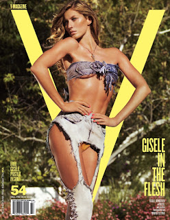
The ‘masthead’ of these magazines are very different from the conventional magazines you see on the newsstands, instead of having the masthead at the top of the page, they both have the letter name of their magazine behind the model which makes it look more interesting and artistic and more appealing to the audience to look at.

Same camera shot used for both of these covers, on V Magazine’s cover, the model Gisele Bundchen has struck into a high fashion couture pose. On mine, I have placed my model in the same position in the middle of the page. This will draw attention straight away from the audience and make them want to know who is on the cover.

 The bar-code has been put at the same place on the pages. By having it at the bottom of the page, it doesn't draw any attention away from the model/ artist featured on the front. When the creator of the page is designing, they also have to think about the page looking aesthetically appealing as well, as this is the audiences main appeal to buy the magazine.

Currently, there are a few magazines that have just one letter for their name. For example with this particular magazine, Q and W magazine which is again a high fashion magazine. I think that reason for this is because by just having one letter, it is more likely to stand out to the audience on a magazine stand because there is just one thing.


Friday, 11 March 2011

Magazine Analysis

Doc1

Pictures

Test Shots:
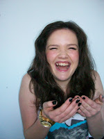
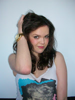
I have taken these test shots before I went ahead and took my real photos, as the model is my friend I really wanted to make her feel comfortable in front of the camera so I tried a couple of things to make her laugh. She did lose one of her front tooth so I think that must have taken a hit to her confidence because normally, she is a very confident person. It took about 5 or ten minutes or so to start getting the pictures that I wanted. Through the test shots, I could see what I needed to improve on whether if it was the angle of the shot or what kind it was like a mid shot or a close up. I found what poses worked and which ones didn't, and I as found out through taken more and more pictures that the best angle and type of shot was a front facing mid shot, it mainly focused on her and the different sides of her from the different expressions through the shots which is what my article is mainly about, how she has overcome her past and starting the new chapter of her life with a new out look on life.


Real Shots:
 After I had taken the real shots, I started seeing the photos that had potential to be put into my magazine, I found a couple of photos which could be my cover and the photos that I could include in my double page spread. I really wanted a variety of different shots to show the different sides of her, so I took a couple of genuine laughing ones and a couple of ones with just some random poses. I also really liked the one where she was standing in the centre of the shot with her hands linked a giving a cheeky smirk to the camera which would make the audience intrigued as why she is smiling if they saw it on a news stand.

Tuesday, 15 February 2011

Magazine Publisher

The company who will publish my magazine would probably be a company like Conde Nast, I really like this company because they publish a lot of well known magazines like 'VOGUE', 'GQ', 'Vainty Fair' and 'LOVE'. They currently don't do a music magazine which is why I would think that my Magazine woud be a good addition to the current collection of magazines they publish. I would say that 6 of the 15 magazines they publish are mainly fashion based, which I think my magazine will go well with, binding music and fashion together will make it appeal to the audiences that would normally buy the fashion magazines, but also open up a new market for pop music lovers.


Pitch Feedback

I thought that my pitch went very well, I presented a 'Animoto' presentation pictures and ideas of what my magazine would be like. I chose the song 'Music' by Madonna as the background to the presentation, I thought I got my ideas across clear and concise, I put the artists which I would like to be in my magazine like Madonna, Britney Spears, Nicki Minaj and Lady Gaga. There, right at the start you knew the feel of what kind of Music was going to be in the magazine. Then presentation moved onto the inpiration of Andy Warhol and his 'Pop Art' which I wanted to incorporate into the magazine. I wanted it to have an artistic edge to it instead of just being a plain music magazine, I thought that this would a good way of attracting to different audiences. In the pitch, I also showed that I the magazine to be Fashion forward but not focusing on the Fashion too much as it is a Music Magazine. But I thought that by making it just a bit Fashionable, it would make it more appealing to the younger audiences I am trying to attract.

Wednesday, 2 February 2011

Audience Profile

I would like to think that the people who would be interested in my Magazine would be fashion forward and interested in Music, Pop and Art. I wanted to incorporate these things into my Magazine because they are what teeangers are interested in. It may not be all of them, but I would think that at least one of the elements of the 3 would be one of the likes of an average teenger therefore I am not only targetting the people who like Pop Music as it s a Pop magazine, I am also targetting other people who have other interests other than Pop Music.

I see that the magazine will be unisex,targetting both sex making it young and modern. even though the magazine itself will be unisex, I would think that depending on each month and who is on the cover, that it would depend who would buy the magazine. For example, artists like Britney Spears and Ncki Minaj would generally be targetted towards girls, but on the other hand, boys would be interested in anything with a attractive woman on the cover which could bring them in to want and read the magazine. Then if I wanted to attract boys to the magazine, as boys don't stereotypically like Pop artists like Madonna or Britney Spears, I would try and incorporate an idea of having a band or an artist from a totally different genre and then having a artist or band from the Pop genre and collaborate them both on the cover and the spread. Hence, this will attract the girls who like Pop Music, and it would also attract to the boys that likes other artist's like Kanye and Kings Of Leon.


Artist Profile

Artist Name: Chanel Smith

Age: 20

Gender: Female

Clothing: Fashion Forward, Pop Chic, Birght Colours, Colour Blocking. Somtimes it gets toned down with just a classic black look.

Lifestyle: Fast past, Travelling, Promoting, Socializing.

Album: The Next Chapter - The new album is going to express the new era of her life, after a recent visit to rehab, and celebrating her 20th birthday back in September, she wants this album to tell the audience the new part of her life and what she has to look forward to.

Genre: She has chosen the 'Pop' genre to focus her music into because it is her favourite genre. She listens to a lot of Pop artists like Rihanna, Katy Perry and Nicki Minaj. Pop is just so versatile, you can recreate different sounds and make them more modern.

History: Chanel actually went to the Univesity of Arts in London, she studied Fashion PR but with 2 years of working in a Fashion PR Firm, she decided to take a new direction and focuse on her singing career. Singing has always been what she has wanted to do since she was the age of 11, her mother actually entered her into a local singing competition and she won. So from there on, singing was her ambition and she worked with vocal coaches to improve her singing.

Inspirations: She is inspired by artists like Madonna, Britney Spears and Christina Aguilera. All of them have created hits after hits and continue to make them. They know how to keep the audience intact and want to  listen to their music, she really likes the fact that Madonna started off as this little innocent girl singing about sex 'Like A Virgin' and then from then to now, she has totally changed herself and her sound. She collaborates with younger artists like Britney in 'Me Against The Music' and Justin Timberlake in '4 Minutes' to gather new younger fans which is what makes her such an inspirations.


Thursday, 27 January 2011

Magazine Article

We caught up with Chanel Smith over the weekend when she was in London promoting her new album ‘The Next Chapter’ with an EXCLUSIVE interview about her recent visit to rehab and her past accomplishments and what we have to look forward to from the international pop star. We travelled from our offices to The Dorchester where she was staying. She had actually flew in from JFK to London the night before and still welcomed us into her room while she was getting ready for a day of promotion with her makeup artist and hair stylist working away for the busy day.

We sat down with a starbucks and talked about her recent visit to the ‘Promises Treatment Centre’ in Malibu, California. It is an Oceanside drug and alcohol treatment facility which has become one of the most popular in the world. Well known celebrities like Robert Downey Jr., Diana Ross, Ben Affleck and Britney Spears were also ex-residents of the centre. The luxurious centre gives promises to deliver results through holistic healing and will only run you a whopping $8,855 a week.

Chanel opened up about the treatment she received and the people she met, she said that going to rehab was ‘the best thing for her at the time’. It also let her get away from all the stress of her crippling relationship in the press with Paul Smith. She wants to move away from the past and get on with her future with her new album and a new era of her life as she has just turned 20 in September.

We moved onto her new album, we asked her what was the inspiration behind the album? ‘REINVENTION’ was the key to the new music, she wanted to change her music as the way she has changed through the stages of her life.

‘I wanted the music to represent where I am at the stage of my life right now.’

‘I have gone through a lot this year, and I want this to be the start of a new me.’

We asked her if there are any artist’s right now that she likes, she replied ‘I like everything, if I like it. I like it.’ She is a huge fan of Nicki Minaj, ‘I really love her! She can sing and rap. And her sound is so versatile, even though she is a pop rapper, she can still mix it with other rappers like Kanye and Diddy and it sounds just amazing.’ We also asked her about the rumours of her and Nicki maybe collaborating, she replied with a promising answer ‘There has definitely been talk, but I don’t want to say too much…But all I can say it that it looks promising’.

We talked about her latest single ‘2.0’ which has sold over a million copies of downloads since it’s been released. We asked her how she felt about it and answered ‘Well, I am so unbelievably happy that my fans have been so supportive. I took a risk by re-inventing myself and my music, so I was definitely really nervous about the response from my fans. But it just means so much to me that they are so supportive and passionate for me.’

Obviously starting in the music industry from the tender age of 15, we asked her if there are any regrets she has had over the years since she released her first album ‘Me’. She replied ‘Oh yes, I definitely have some regrets over the years, I’m not perfect you know. No one is and everyone makes mistakes at least once or twice in their lives, I think these mistakes are the things that make you the person you are today. Without them, you’re not you. I definitely regret going down the road of just partying all the time and drinking, I was naïve back then. I was young and I just got sucked into all of it, I really wished that it never happened. But, I chose to change my life by getting better and getting myself the help that I needed and now, I feel like a better person. I honestly think that this is the happiest I have been in a while.’

She also opened up about her relationship with her estranged mother who she only met when she turned 16. ‘When I released my first album, about a year later for the first time, I met my mother. My parents split up at the age of 2 or 3 and I had always lived my father and I had never talked or seen her before. But my dad did keep a photo her holding me in the hospital on the day I was born. I had always kept that close to my heart, I would look at it and dream of meeting her. I had no idea that so much people would buy my album, and obviously it gave me more opportunities, I bought a house for my father and made sure that he was comfortable after all he did look after for nearly all my life, and then I hired a private investigator to find my mother. It actually only took a few days for him to find her, so I flew to New York where she was living and knocked on her door. I was so unbelievably nervous. She opened the door, and we just hugged and cried. It was just the most amazing moment of my life. Now she is in my life and I am just so happy, she was also there for me when I was going through rehab and I just cant say how lucky I am to have her in my life right now.’

Then we went onto the subject of what we have to look forward to from the young starlet, she said that there are a lot of things she has been looking into, she has a new TV show coming out called ‘The fast life with Chanel’ which keeps up with her for a few months and lets us take a more personal view into her life, get to know who she really is and what she has been up to for the past few months.

That was it from The Chanel Smith, we hope and wished her a successful album and happiness and we do hope we get to meet again.

Friday, 14 January 2011

Artist Inpiration

Andy Warhol
Andy Warhol was an American  paintist, Film-Maker and a pintmaker. I thought that I would include his elements of using bright colours to my magazine because the idea of  'Pop Art' would go well with my 'Pop' magazine. I thought that the bright colours and colour blocking would express the 'Pop' genre.

A good exmaple of this is when Madonna released her album 'Celebration', on the cover she used a picture of when she was younger with Andy Warhol effects. I think that Madonna has done this because she, has become such a iconic character for the 'Pop' culture. She has reinvented herself and her music so many times. Through her music, you can clearly see her change through the stages of her life, for example she started off with songs like 'Lucky Star' and 'Like a Virgin' which represented the adolescent age of her life. At the age that she currently 52, she has still continues to create hits and re-create the sound of her music. She collaborates with younger artists like 'Justin Timberlake' and 'Pharrel Williams' to try and appeal to a more younger audience that wasn't there at the time when she first came onto the scene. Looking at the album cover, you can clearly see the resemblence to the Marilyn Manroe canvas. When Warhol did the Marilyn Manroe canvas, he did more than one. I think that he did this because he was trying to express the different sides of Marilyn.